Performance and Issue-Based Evaluation
Chase Bank App
Master’s Project
UX Research
My Role:
Timeline : 6 weeks
UX Researcher | User Testing

Check account balances
Transfer funds
Deposit Checks
Credit card activites
Spend notification
Track Spending
Wire transfers
Pay bills
Overview of App
The Chase Bank app is a mobile application designed for customers to conveniently manage their chase banking needs on their smartphones. It provides convenient access to account information, transaction history, and secure, real-time mobile banking services.
It allows users to perform various tasks, Such as:
My Role
Feedback
Post-analysis, my role involved synthesizing and presenting insights derived from the evaluation, offering actionable feedback
Data Analysis
I was responsible for analyzing the System Usability Scale (SUS) ratings, confidence interval and proportion of success transforming raw data into actionable insights
User Interaction Sessions
I was responsible for analyzing the System Usability Scale (SUS) ratings, confidence interval and proportion of success transforming raw data into actionable insights
Study Plan
I played a pivotal role in formulating the study's structure, ensuring a well-rounded analysis that encompassed both qualitative and quantitative research methods.
Study Goal For User Research
1. Usability Assessment: To comprehensively evaluate the usability of the Chase Bank app, identifying areas of improvement and opportunities for enhancing the user experience.
2. User Feedback Collection: To gather qualitative insights through think-aloud sessions and user interviews, aiming to understand user challenges, preferences, and suggestions for app enhancements.
3. Data Analysis: To assess the app's overall usability using the SUS framework, quantifying user satisfaction and providing a quantitative measure of app usability.
4. Actionable Recommendations: To synthesize findings and provide clear, actionable recommendations for refining the Chase Bank app, improving its overall usability, and addressing identified issues.
Interviews
The interviews conducted as part of our evaluation process provided valuable qualitative insights into the user experience of the Chase Bank app. Through exploratory conversations with participants, we gained a deeper understanding of their interactions, challenges, and preferences while using the app. These interviews revealed nuanced aspects of user engagement and highlighted user perspectives that extended beyond surface-level observations.
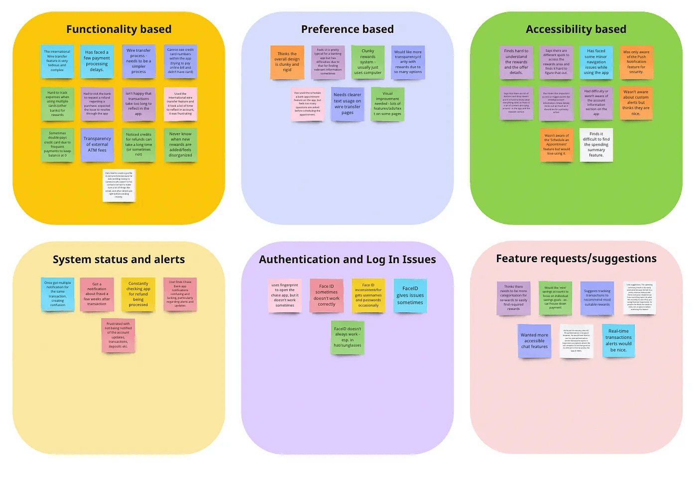
Affinity mapping
We analyzed our data through affinity diagramming. Each interviewer prepared an organized set of notes relating to each question in their interviews and used them to create sticky notes using Miro. Each idea was first placed on a board and sorted by the participant, with the participant demographics listed alongside each grouping.

Codes
Following this, we collaborated to identify similar ideas that were found across participants. We grouped these into codes on the next board and labelled the groups.
Interviews
Think aloud
Data Analysis
Recommendations
Interviews
Think aloud
Data Analysis
Recommendations
Interviews
Think aloud
Data Analysis
Recommendations
Think Aloud
Goal : The primary goal of our think-aloud sessions was to gain real-time insights into user interactions with the Chase Bank app. By prompting participants to verbalize their thoughts and actions while navigating the app, we aimed to identify navigation pain points, successes, and areas of improvement.
Tasks
Through our interviews, it became clear that users had trouble setting up security alerts and keeping track of their spending habits. Therefore, we decided on two distinct tasks which highlighted these key issues.
Task 1: Set up a notification for the Chase Bank App to notify you when your debit card is charged for more than $75.00.
Task 2: Find how much you spent on Food & Drink last month (guide user to ‘Spending Summary’ feature if they can’t find it)
Success and Failure criteria
Success and failure criteria in the think-aloud session were essential to objectively evaluate the system's performance. They provided clear benchmarks for assessing how well the system met user needs (success) or where it fell short (failure). This enabled us to make data-driven improvements and prioritize user satisfaction and task effectiveness.
Task 1: Set up a notification for the Chase Bank App to notify you when your debit card is charged for more than $75.00.
Success Criteria
Successfully sets up the notification on their app.
Fails to set up the notifications on their app.
Failure Criteria
Task 2: Find how much you spent on Food & Drink last month (guide user to ‘Spending Summary’ feature if they can’t find it)
Success Criteria
Successfully finds the feature and reports how much was spent on Food & Drink last month.
Fails to find the feature or report how much was spent on Food & Drink last month.
Reports incorrect data.
Failure Criteria
Quantitative Analysis
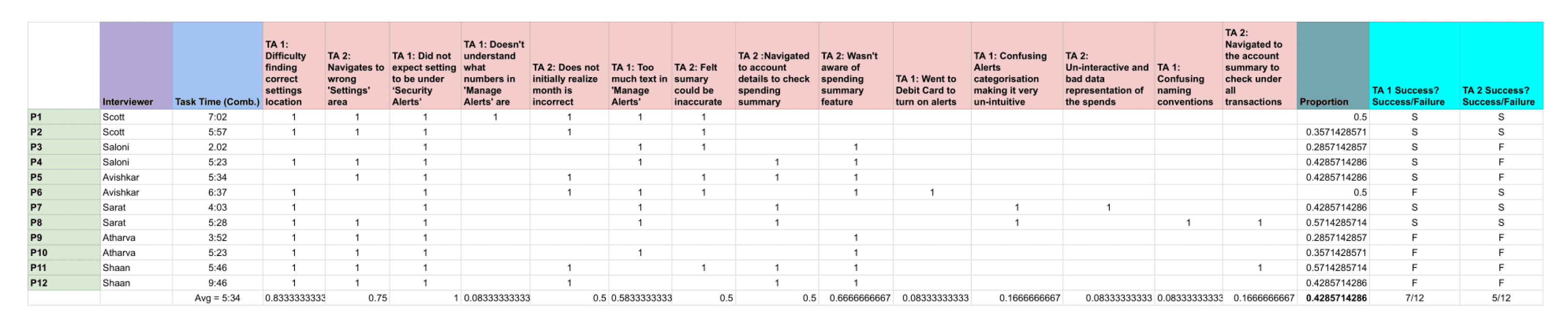
Our data was analyzed to find the proportion of success for each task, 95% confidence interval for each task, and the likelihood of success for at least 70% of users for each task in our study.
Issues
Task 1
Settings navigation : Difficulty finding the correct settings location / Navigating to the wrong "Settings" area.
Setting expectations : Did not expect the setting to be under "Security Alerts".
Alert settings : Doesn't understand what the numbers in "Manage Alerts" are / Too much text in "Manage Alerts" / Confusing alerts categorization / Confusing naming conventions.
Task 2
Month selection: Doesn't initially realize month is incorrect.
Spending summary awareness: Wasn't aware of the spending summary feature / Navigated to account details to check spending summary.
Spending summary accuracy: Felt summary could be inaccurate / Un-interactive and bad data representation of the spends
Likelihood of success for 70% of Participants:
For each task, we also calculated the likelihood that 70% of the population would be able to complete each task successfully based on the data we collected.
Calculating Proportion of Success
To quantify the system's task success rate we calculated the proportion of success. This measure helped us objectively assess the system's effectiveness in task completion, providing valuable insights into areas that required improvement
Task 1 : 7 out of 12 participants were successful.
We used the One Sample Proportion Calculator from MeasuringU and determined there is a 39.19% chance the success rate for Task 1 is greater than 70%.
Task 2: only 5 out of 12 participants successfully completed the task.
Using the same calculator, we determined there is only a 0.56% chance the success rate for Task 2 is greater than 70%.

Proportion of Success for Task 1
Result=58.33333334
Task 1 = 7 (Number of users who completed the task) X 100
12 (Number of users who attempted the task)
Proportion of Success for Task 2
Result=41.66666667
Task 2 = 5 (Number of users who completed the task) X 100
12 (Number of users who attempted the task)
Confusing wording
Other Key Issues
“As it’s about my transaction notification, why is it under security? I assumed it would be in payments”
Unmet Expectation
“Back In India, I used to use the AXIS bank app, which had its spending summary under the transactions section, so my mind immediately went to transaction statements”
Alert Setting
“When I clicked on the manage alerts setting, there was too much text jargon that ended up confusing me.
Methods used
User Interviews:
These in-depth conversations provided initial insights into the user's overall experience, shedding light on the broader context of app usage.
Think Aloud Sessions:
Carried out with meticulous observation, these sessions illuminated specific challenges and areas of success in user navigation within the app.
SUS Ratings:
The System Usability Scale questionnaire was employed to quantitatively measure user satisfaction.
Confidence Interval:
We assessed SUS ratings using a confidence interval to ensure the reliability of our quantitative findings.
Proportion of Success:
We calculated the proportion of successful interactions, offering a quantitative measure of the app's usability and effectiveness.
Intended users
Individuals aged 18 and above.
Current users of the Chase Bank mobile app.
Individuals who use the app for various banking activities such as checking balances, making transactions, paying bills, and more.
Participants with a range of experience levels, from novice to experienced app users.
The participants in this observation and interview study are individuals who regularly use the Chase Bank mobile app for their banking needs. These participants are chosen because they represent the primary user base of the app and can provide valuable insights into their experiences, pain points, and preferences while using the app.
Number of Participants: We recruited 12 participants for interviews. This sample size provided a sufficient variety of perspectives and experiences while maintaining the feasibility of data collection and analysis.
Inclusion Criteria:
Data Collection:
Data for the user research was collected through a combination of methods tailored to the different phases of the research: background data through Google Forms and user interviews conducted in person
1. Background Data Collection (Google Forms):
Background information and contextual data were collected from participants using a Google Form questionnaire. This online survey tool allowed participants to provide essential demographic information, including age, occupation, ethnicity
2. Interview Notes:
Data from in-depth interviews was collected through detailed interview notes. These semi-structured interviews aimed to explore participants' experiences, pain points, and preferences while using the Chase Bank app.
- During interviews, open-ended questions were used to encourage participants to share their insights, frustrations, and suggestions for app improvement. Interviewers took comprehensive notes to capture participants' responses and key quotes.
Think Aloud Findings
We recorded the time on task and success and failure rate of the given tasks. It was discovered that almost 50% of the users failed between the two given tasks. From here we conducted a quantitative analysis of rate of success and failure to find the confidence interval and proportion of success.
Time Required:
The time required to complete these tasks (total, not including follow-up questions) ranged from
2:02 to 7:02 with a median of 5:34.
Success and Failure
Task 1 : 7 out of 12 Success
Task 2 : 5 out of 12 Success
Design recommendations
1. Enhance Feature Discoverability:
Consider implementing an onboarding tutorial or a guided tour for first-time users. This will help them become familiar with the app's key features, such as notifications and spending summaries, right from the start.
Employ intuitive icons and clear visual cues to assist users in identifying and accessing essential functions effortlessly. Visual elements can often convey information more quickly than text.
2. Clarify Terminology and Match User Expectations:
Reevaluate the terminology used in the app to ensure it aligns with users' mental models. Replace ambiguous terms like "Alerts" with more straightforward terms like "Notifications" to reduce confusion.
Provide clear descriptions or tooltips for terms that might be unclear to users, helping them understand the purpose of each feature.
3. Optimize Information Hierarchy:
Prioritize the display of the most frequently used features within the app, such as spending summaries. These should be easily accessible from the main navigation menu or dashboard.
Implement a well-organized menu structure with logically grouped options in the notification settings. This will streamline the user's journey through the app and minimize cognitive load.
4. Simplify Configuration and Settings:
Combine the setup of alerts/notifications and spending summary features into a unified "Account Settings" section. This consolidation will make it more convenient for users to locate and manage these features within a single interface.
Implement a step-by-step configuration process with clear instructions, guiding users through the setup of alerts and notifications. Make sure users understand the purpose of each setting.
5. User-Centric Categorization:
Revisit the categorization of Alert configuration options to align them with user expectations. Place related settings, such as transaction alerts and debit card alerts, under more intuitive categories like "Payment Preferences" or “Spending/Balance Alerts”
Allow users to customize their own categories or prioritize frequently used settings to further personalize their experience.
6. User-Focused Content Presentation:
Minimize unnecessary text and prioritize concise, user-friendly explanations. This will reduce cognitive load and help users quickly grasp the essential information they need.
Consider implementing filters or sorting options within each category of settings, allowing users to quickly find and customize their preferences based on relevance.
Reflection
Takeaways
Overall, our investigation into issues related to Chase Bank app’s security alert and spending summary features identified
14 common themes between the 12 participants we interviewed, with other outlying issues being noted as well. The success rate for both tasks was lower than expected and we considered it unacceptable for task 2. After qualitatively coding and organizing these themes, we quantitatively analyzed the findings to better understand the severity of found issues. Finally, we developed 6 design recommendations.
Interviews
Think aloud
Data Analysis
Recommendations
This Case study has been parked since 2023.
This was one of my first case studies and although I am proud of my work and the learnings I gained I can see many opportunities of improvement and growth here.